
Next.jsに新しくなったMUI(Material-UI v5)とEmotionを導入して新機能を試す
Material UI の v5 がリリースされました。
v5 から MUI として新しくリニューアルされました。
公式サイトもリニューアルしていますね。
v5 から内部で使用されているスタイリングソリューションが Emotion か styled-components か選択できます。
今回は Next.js/Typescript プロジェクトに Material-UI/Emotion を導入します。
また今回から新たに追加された MUI の新機能や変更された記述方法を試してみます。
今回ソースは基本的には公式 Github の example を参照致しました。
環境
- macOS Big Sur 11.15.2
- Next.js 11.1.2
- Typescript 4.4.3
- npm 7.7.6
- yarn 1.22.4
Next.js のプロジェクトを作成
以下のコマンドを実行して Typescript 導入済みの Next.js プロジェクトを作成します。
- npx
npx create-next-app next-mui-emotion-sample --typescript- yarn
yarn create next-app next-mui-emotion-sample --typescriptアプリケーション作成完了後、プロジェクトのルートディレクトリへ移動します。
cd next-mui-emotion-sample雛形を作成したら、 yarn dev でアプリケーションを起動し、 http://localhost:3000 を開いて Next の初期画面が表示されることを確認します。
MUI と Emotion を install する
- npm
npm install @mui/material @emotion/react @emotion/styled @emotion/cache @emotion/server- yarn
yarn add @mui/material @emotion/react @emotion/styled @emotion/cache @emotion/server後ほど作成する .babelrc で読み込む Emotion の devDependencies package も install します。
- npm
npm install -D @emotion/babel-plugin- yarn
yarn add -D @emotion/babel-plugininstall した package を確認する
- npm
$ npm list --depth=0 |grep -e mui -e emotion
├── @emotion/babel-plugin@11.3.0
├── @emotion/cache@11.4.0
├── @emotion/react@11.4.1
├── @emotion/server@11.4.0
├── @emotion/styled@11.3.0
├── @mui/material@5.0.3- yarn
$ yarn list --depth=0 |grep -e mui -e emotion
├─ @emotion/babel-plugin@11.3.0
├─ @emotion/cache@11.4.0
├─ @emotion/hash@0.8.0
├─ @emotion/is-prop-valid@1.1.0
├─ @emotion/memoize@0.7.5
├─ @emotion/react@11.4.1
├─ @emotion/serialize@1.0.2
├─ @emotion/server@11.4.0
├─ @emotion/sheet@1.0.2
├─ @emotion/styled@11.3.0
├─ @emotion/unitless@0.7.5
├─ @emotion/utils@1.0.0
├─ @emotion/weak-memoize@0.2.5
├─ @mui/core@5.0.0-alpha.49
├─ @mui/material@5.0.3
├─ @mui/private-theming@5.0.1
├─ @mui/styled-engine@5.0.1
├─ @mui/system@5.0.2
├─ @mui/types@7.0.0
├─ @mui/utils@5.0.1
Emotion の JSX Pragma を省略する設定をする
通常 React で Emotion を import する時に JSX Pragma である /** @jsxImportSource @emotion/react */ を記述しないと動作しません。
毎回 JSX Pragma を記述するのは手間なので .babelrc で Pragma を書かなくて良いようにします。
package.json と同じ階層に .babelrc ファイルを作成し、先程 install した @emotion/babel-plugin を有効化します。
{
  "presets": [
    [
      "next/babel",
      {
        "preset-react": {
          "runtime": "automatic",
          "importSource": "@emotion/react"
        }
      }
    ]
  ],
  "plugins": ["@emotion/babel-plugin"]
}
Emotion の CSS Prop 設定をする
CSS Prop を自動ランタイムを使用する場合は、TypeScript に JSX 名前空間を検索する場所を通知する必要があります。
.tsconfig に 1 行 jsxImportSource: @emotion/react を追記します。
{
  "compilerOptions": {
    "target": "es5",
    "lib": ["dom", "dom.iterable", "esnext"],
    "allowJs": true,
    "skipLibCheck": true,
    "strict": true,
    "forceConsistentCasingInFileNames": true,
    "noEmit": true,
    "esModuleInterop": true,
    "module": "esnext",
    "moduleResolution": "node",
    "resolveJsonModule": true,
    "isolatedModules": true,
    "jsx": "preserve",
    "jsxImportSource": "@emotion/react" // Added
  },
  "include": ["next-env.d.ts", "**/*.ts", "**/*.tsx"],
  "exclude": ["node_modules"]
}
Material-UI 用の theme を作成する
プロジェクトルートに src ディレクトリを作成してください。
次に Material-UI の theme 作成の為、 src/theme.ts を作成します。
こちらのファイルは今後開発中に Material-UI のデフォルト theme を変更したい時に利用します。
以下の例は MUI のテーマカラーをデフォルトから変更しています。
import { createTheme } from "@mui/material/styles";
import { red } from "@mui/material/colors";

const theme = createTheme({
  palette: {
    primary: {
      main: "#556cd6",
    },
    secondary: {
      main: "#19857b",
    },
    error: {
      main: red.A400,
    },
  },
});

export default theme;
Emotion cache を作成する
src/createEmotionCache.ts を作成して以下を追記します。
import createCache, { EmotionCache } from '@emotion/cache';

export default function createEmotionCache(): EmotionCache {
  return createCache({ key: 'css' });
}
こちらの詳細に関しては以下公式ドキュメントを調査次第追記します。
_app.tsx を編集する
material-ui と Emotion を全画面共通で利用出来るよう pages/_app.tsx を編集します。
import * as React from "react";
import { AppProps } from "next/app";
import PropTypes from "prop-types";
import Head from "next/head";
import { ThemeProvider } from "@mui/material/styles";
import CssBaseline from "@mui/material/CssBaseline";
import { CacheProvider, EmotionCache } from "@emotion/react";
import theme from "../src/theme";
import createEmotionCache from "../src/createEmotionCache";

// Client-side cache, shared for the whole session of the user in the browser.
const clientSideEmotionCache = createEmotionCache();

interface MyAppProps extends AppProps {
  emotionCache?: EmotionCache;
}

function MyApp(props: MyAppProps) {
  const { Component, emotionCache = clientSideEmotionCache, pageProps } = props;

  return (
    <CacheProvider value={emotionCache}>
      <ThemeProvider theme={theme}>
        {/* CssBaseline kickstart an elegant, consistent, and simple baseline to build upon. */}
        <CssBaseline />
        <Component {...pageProps} />
      </ThemeProvider>
    </CacheProvider>
  );
}

MyApp.propTypes = {
  Component: PropTypes.elementType.isRequired,
  emotionCache: PropTypes.object,
  pageProps: PropTypes.object.isRequired,
};

export default MyApp;
_document.tsx を作成する
最後に MUI / Emotion を SSG/SSR に対応させる為、 pages/_document.tsx を作成します。
_document.tsx は Next の独自ファイルで HTML の <html> や <body> タグの拡張に使われます。
注意すべき点は _document.tsx はサーバーサイドのみでレンダリングされ、クライアントサイドでは使われません。
onClick のようなイベントハンドラはここに追加しないでください。
import * as React from "react";
import { RenderPageResult } from "next/dist/shared/lib/utils";
import Document, {
  Html,
  Head,
  Main,
  NextScript,
  DocumentInitialProps,
} from "next/document";
import createEmotionServer from "@emotion/server/create-instance";
import createEmotionCache from "../src/createEmotionCache";
import theme from "../src/theme";

export default class MyDocument extends Document {
  render(): JSX.Element {
    return (
      <Html lang="ja">
        <Head>
          {/* PWA primary color */}
          <meta name="theme-color" content={theme.palette.primary.main} />
          <link
            rel="stylesheet"
            href="https://fonts.googleapis.com/css?family=Roboto:300,400,500,700&display=swap"
          />
        </Head>
        <body>
          <Main />
          <NextScript />
        </body>
      </Html>
    );
  }
}

// `getInitialProps` belongs to `_document` (instead of `_app`),
// it's compatible with static-site generation (SSG).
MyDocument.getInitialProps = async (ctx): Promise<DocumentInitialProps> => {
  // Resolution order
  //
  // On the server:
  // 1. app.getInitialProps
  // 2. page.getInitialProps
  // 3. document.getInitialProps
  // 4. app.render
  // 5. page.render
  // 6. document.render
  //
  // On the server with error:
  // 1. document.getInitialProps
  // 2. app.render
  // 3. page.render
  // 4. document.render
  //
  // On the client
  // 1. app.getInitialProps
  // 2. page.getInitialProps
  // 3. app.render
  // 4. page.render

  const originalRenderPage = ctx.renderPage;

  // You can consider sharing the same emotion cache between all the SSR requests to speed up performance.
  // However, be aware that it can have global side effects.
  const cache = createEmotionCache();
  const { extractCriticalToChunks } = createEmotionServer(cache);

  ctx.renderPage = (): RenderPageResult | Promise<RenderPageResult> =>
    originalRenderPage({
      enhanceApp:
        (App: any) =>
        // eslint-disable-next-line react/display-name
        (props): JSX.Element =>
          <App emotionCache={cache} {...props} />,
    });

  const initialProps = await Document.getInitialProps(ctx);
  // This is important. It prevents emotion to render invalid HTML.
  // See https://github.com/mui-org/material-ui/issues/26561#issuecomment-855286153
  const emotionStyles = extractCriticalToChunks(initialProps.html);
  const emotionStyleTags = emotionStyles.styles.map((style) => (
    <style
      data-emotion={`${style.key} ${style.ids.join(" ")}`}
      key={style.key}
      // eslint-disable-next-line react/no-danger
      dangerouslySetInnerHTML={{ __html: style.css }}
    />
  ));

  return {
    ...initialProps,
    // Styles fragment is rendered after the app and page rendering finish.
    styles: [
      ...React.Children.toArray(initialProps.styles),
      ...emotionStyleTags,
    ],
  };
};
これで Next.js/TypeScript のプロジェクトでも Material-UI と Emotion を利用することが出来ます。
MUI の新記述でスタイリングする
MUI v4 の makeStyles は廃止され、v5 からは styled を使います。
Emotion の css props は @mui/styled-engine を import して利用できます。
pages/index.tsx に以下を追記します。
import { styled } from "@mui/system";
import { css } from "@mui/styled-engine";

const RedColor = css({
  color: "red",
});

const Welcome = styled("span")({
  color: "lightblue",
  backgroundColor: "blue",
  padding: 8,
  borderRadius: 4,
});

const Home: NextPage = () => {
  return (
    <div className={styles.container}>
      <Head>
        <title>Create Next App</title>
        <meta name="description" content="Generated by create next app" />
        <link rel="icon" href="/favicon.ico" />
      </Head>

      <main className={styles.main}>
        <h1 className={styles.title}>
          <Welcome>Welcome to</Welcome>{" "}
          <a href="https://nextjs.org">Next.js!</a>
        </h1>

        <p className={styles.description}>
          <span css={RedColor}>Get started by editing</span>{" "}
          <code className={styles.code}>pages/index.js</code>
        </p>
            :
            :
        </main>
      </div>
yarn dev でアプリを起動すると index ページが以下のようにスタイリングされることが確認できます。
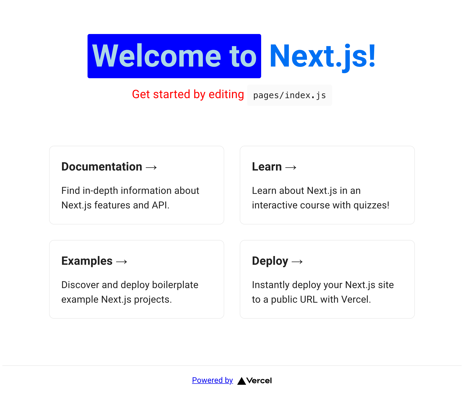
もし Emotion のスタイリングが適用されなかった場合、プロジェクトルートに生成される .next ディレクトリを削除して再度アプリの起動を実行してください。
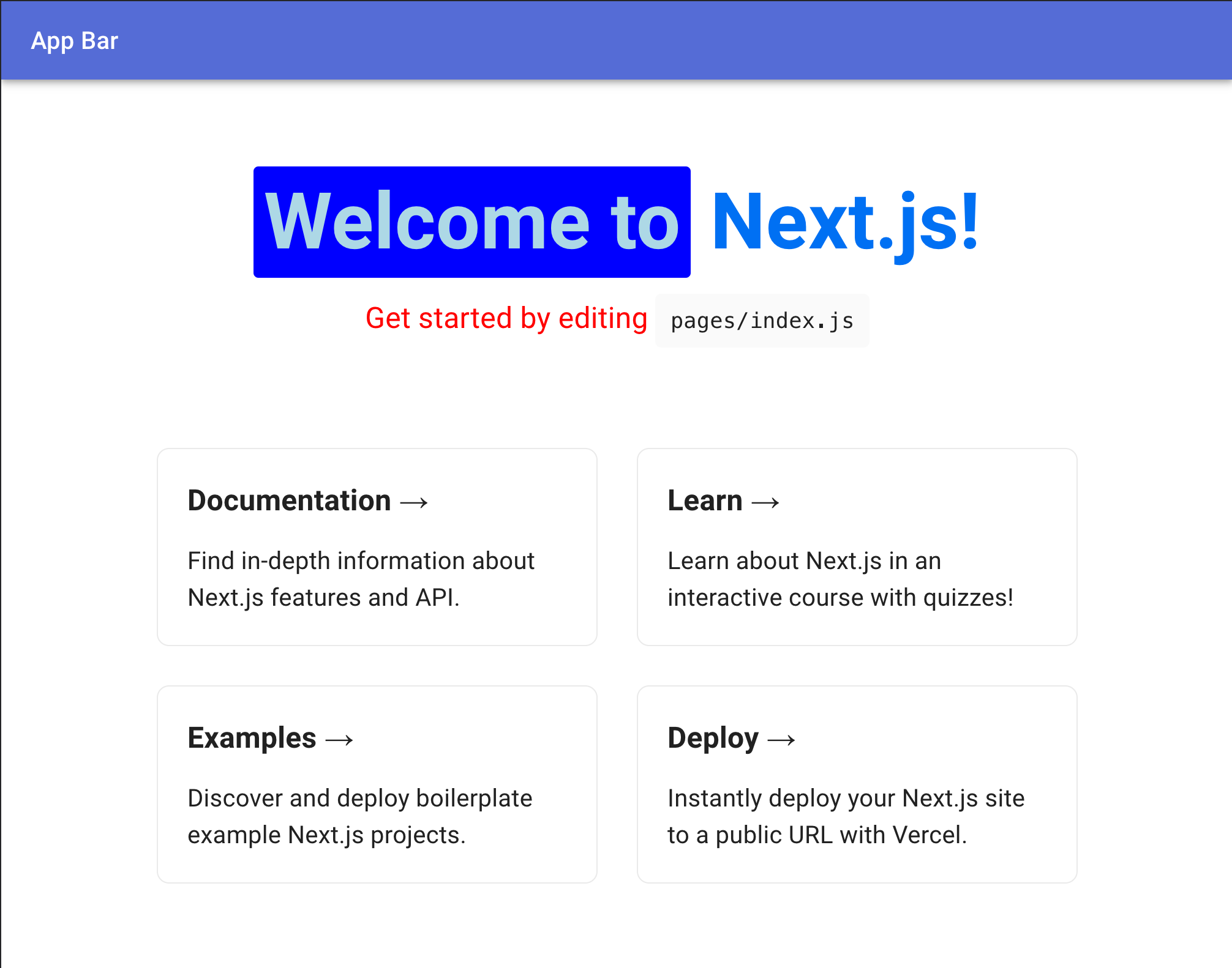
次に MUI の AppBar を表示してみます。
className={styles.container} の div タグはデフォルト位置から変更しています。
import { styled } from "@mui/system";
import { css } from "@mui/styled-engine";
import { AppBar, Toolbar, Typography } from "@mui/material";

const RedColor = css({
  color: "red",
});

const Welcome = styled("span")({
  color: "lightblue",
  backgroundColor: "blue",
  padding: 8,
  borderRadius: 4,
});

const Home: NextPage = () => {
  return (
    <>
      <Head>
        <title>Create Next App</title>
        <meta name="description" content="Generated by create next app" />
        <link rel="icon" href="/favicon.ico" />
      </Head>
      <AppBar position="static">
        <Toolbar>
          <Typography variant="h6" component="div" sx={{ flexGrow: 1 }}>
            App Bar
          </Typography>
        </Toolbar>
      </AppBar>
      <div className={styles.container}>
        <main className={styles.main}>
          <h1 className={styles.title}>
            <Welcome>Welcome to</Welcome>{" "}
            <a href="https://nextjs.org">Next.js!</a>
          </h1>
            :
            :
        </main>
      </div>
AppBar が表示されました。
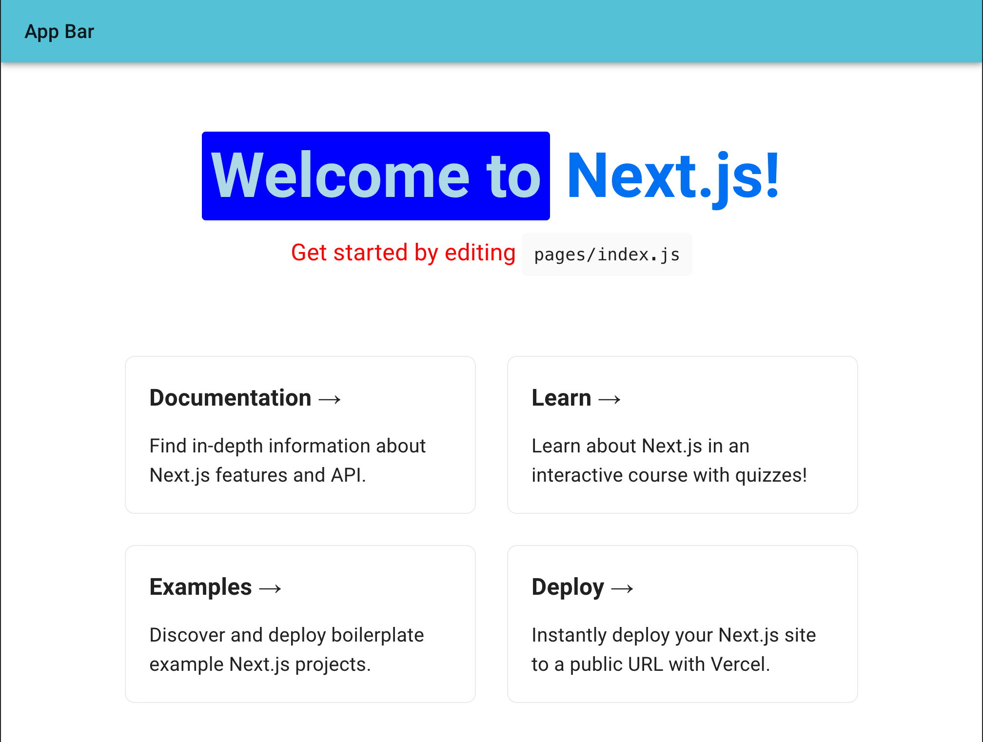
AppBar の backgroundColor は src/theme.ts ファイルの theme.palette.primary.main が適用されています。
_app.tsx ファイルで <ThemeProvider theme={theme}> を設定しているので、自動的に theme ファイルの設定が反映されます。
次に primary.main の色を変更してみます。
const theme = createTheme({
  palette: {
    primary: {
      main: '#55c1d6',
    },
    secondary: {
      main: '#19857b',
    },
    error: {
      main: red.A400,
    },
  },
});

export default theme;
AppBar の色が変わりました。
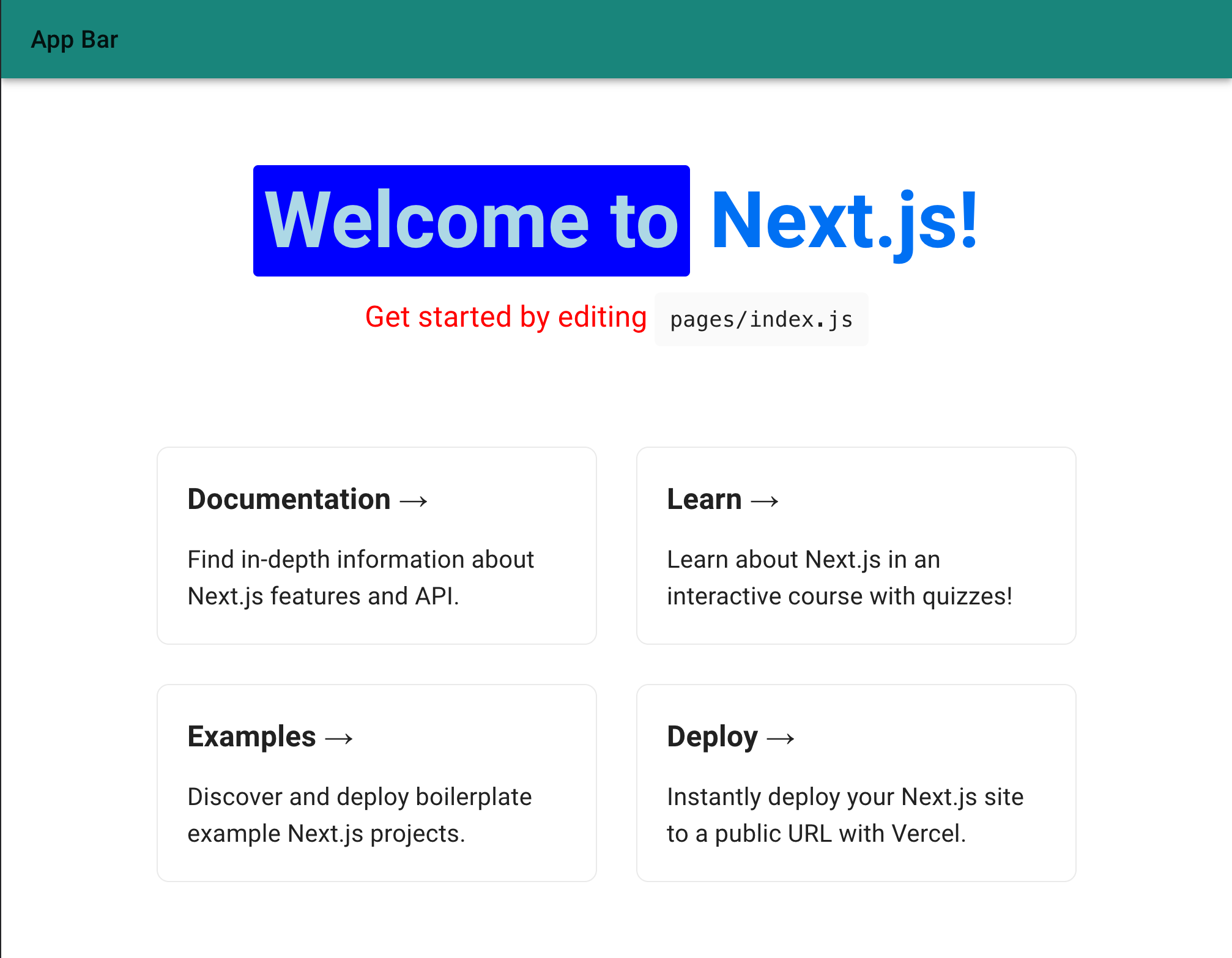
最後に、AppBar の個別カスタマイズをしてみます。
styled の引数にカスマイズしたいコンポーネントを渡します。
theme は styled の callback でも受け取ることができます。
以下のように CustomAppBar を定義し、backgroundColor に secondary.main カラーを設定します。
import { styled } from "@mui/system";
import { css } from "@mui/styled-engine";
import { AppBar, Toolbar, Typography } from "@mui/material";

const CustomAppBar = styled(AppBar)(({ theme }) => ({
  backgroundColor: theme.palette.secondary.main,
}));

const Home: NextPage = () => {
  return (
    <>
      <Head>
        <title>Create Next App</title>
        <meta name="description" content="Generated by create next app" />
        <link rel="icon" href="/favicon.ico" />
      </Head>
      <CustomAppBar position="static">
        <Toolbar>
          <Typography variant="h6" component="div" sx={{ flexGrow: 1 }}>
            App Bar
          </Typography>
        </Toolbar>
      </CustomAppBar>
このように secondary.main カラーが適用されました。
新機能 SX Prop を使う
MUI v5 から sx prop が追加されました。
この公式のドキュメントがすごく分かりやすいです。
sx prop は通常のスタイル定義が書けることの他、以下が使用できます。
- 特定の CSS プロパティのエイリアス
- テーマ情報とマッピングされた値
- 疑似要素
- メディアクエリ
- ネストが使用可能
CSS プロパティに関しては公式の一覧を参照ください。
theme は sx prop を使用して指定することができます。
便利ですね!
<AppBar position='static' sx={{ backgroundColor: 'secondary.main' }}>
  <Toolbar>
    <Typography variant='h6' component='div' sx={{ flexGrow: 1, color: 'primary.main' }}>
      App Bar
    </Typography>
  </Toolbar>
</AppBar>
また、sx prop なら theme を callback でも受け取ることができます。
theme にマッピングされた値を元に加工した値を設定できます。
<AppBar
  position="static"
  sx={{
    backgroundColor: "secondary.main",
    height: (theme) => theme.spacing(10),
  }}
>
また疑似要素も適用できます。
<AppBar
  position="static"
  sx={{
    '&:hover': {
      boxShadow: 10
    },
  }}
>
メディアクエリも書けます。
<Box
  sx={{
    '@media (max-width: 600px)': {
      width: 300,
    }
  }}
>
ネストにも対応しています。
<Box
  sx={{
    '& span': {
      bgcolor: 'primary.main',
    },
  }}
>
  <span>test</span>
</Box>
おわりに
その他、今回ほんの一部しか紹介できていませんが、v5 では様々な機能が追加されています。
破壊的変更が入っており、v4 からの migration もボリューミーですが移行する価値は十分にあると感じました。
今回 MUI と Emotion を設定したサンプルアプリは Github にあるのでご参照ください。